Insights people - if you want people to understand & share your work, don't publish the top chart.
Common situation: you've got data you want to dig into and it has two key parts, a time component and a segmentation.
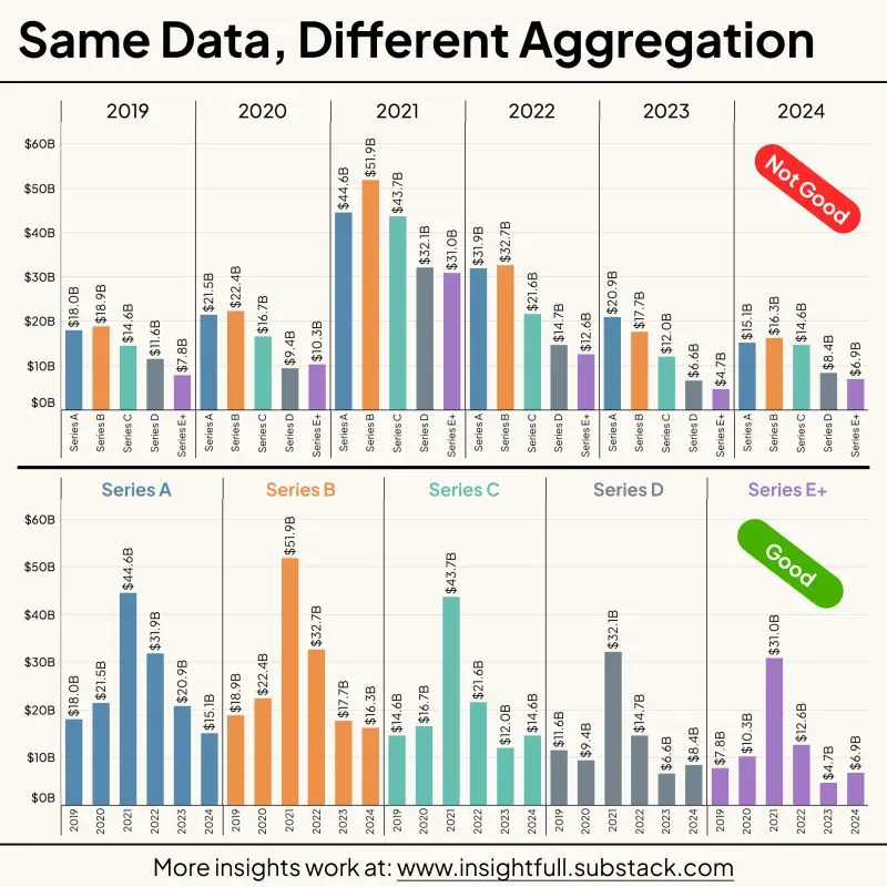
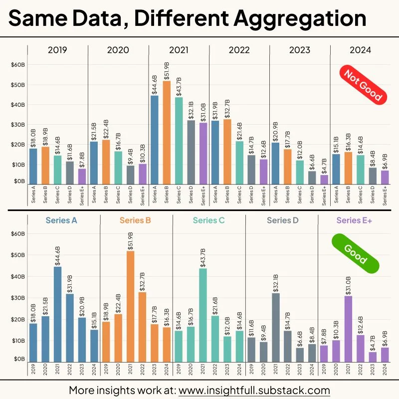
Making the time variable the primary aggregation results in the Not Good version of the chart. What's the takeaway here? What's the story? I can't compare the segments to each other in a way that makes sense at a glance.
Simply flip the primary aggregation to the segments instead and instantly things make more sense. Now the reader can follow the trend over time within each segment without having to do so much mental work.
And if you want to make a different point, use a different chart! Stacked 100% bars perhaps for that top one or something else.
Data viz rant over 😁
#insights #charts #dataviz

DISCLOSURE: This communication is on behalf of eShares, Inc. dba Carta, Inc. ("Carta"). This communication is for informational purposes only, and contains general information only. Carta is not, by means of this communication, rendering accounting, business, financial, investment, legal, tax, or other professional advice or services. This publication is not a substitute for such professional advice or services nor should it be used as a basis for any decision or action that may affect your business or interests. Before making any decision or taking any action that may affect your business or interests, you should consult a qualified professional advisor. This communication is not intended as a recommendation, offer or solicitation for the purchase or sale of any security. Carta does not assume any liability for reliance on the information provided herein. © 2026 Carta. All rights reserved. Reproduction prohibited.