
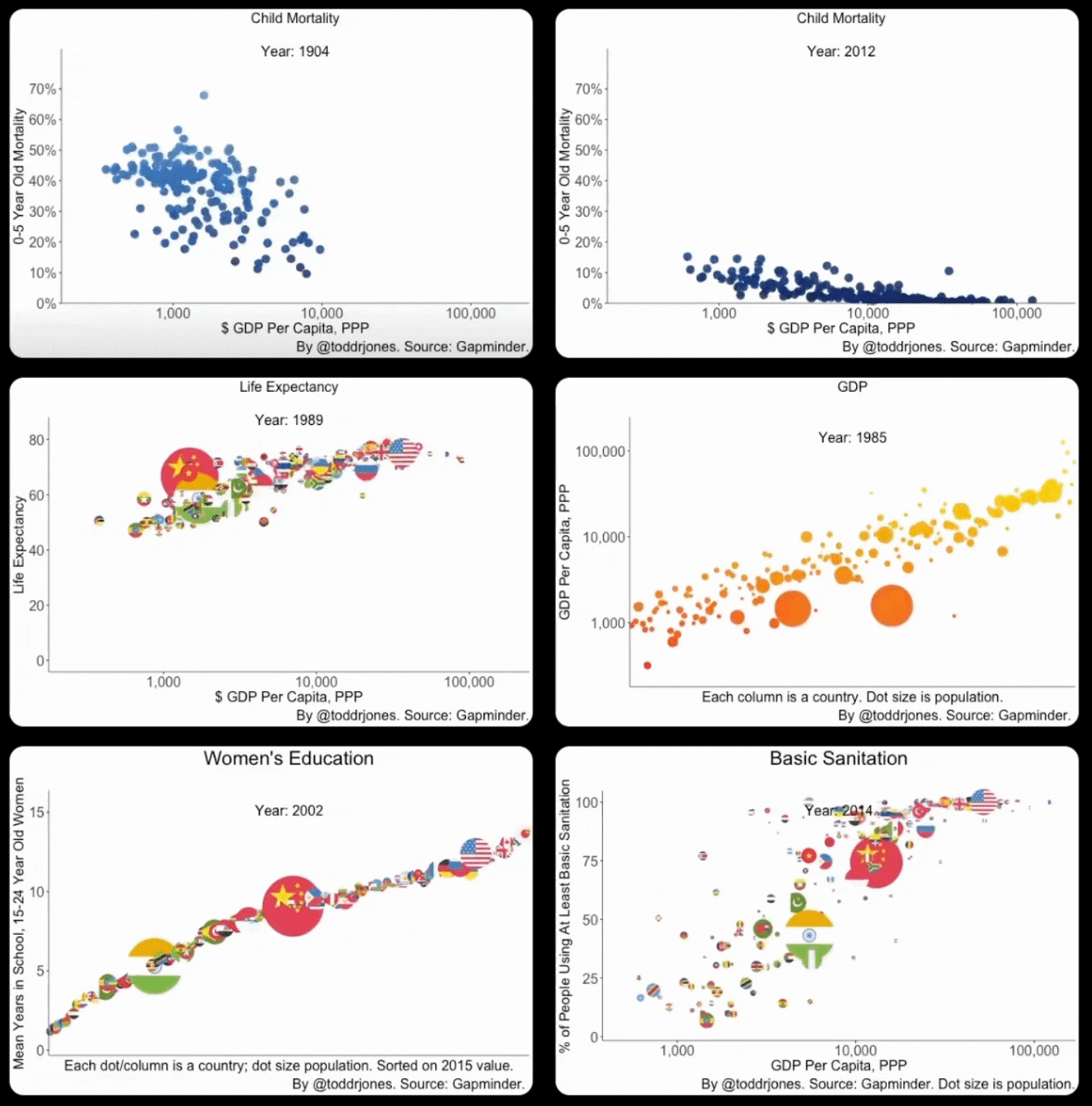
A few ways in which things are getting better.
Shouts to Todd Jones of Mississippi State for the visual, but also for reminding me of the first data viz love we all had (Hans Rosling going through these animated scatter plots from Gapminder in 2005-2006).
That TED Talk changed the way I thought about charts. If you haven't looked it up, it's worth your time 🙏

DISCLOSURE: This communication is on behalf of eShares, Inc. dba Carta, Inc. ("Carta"). This communication is for informational purposes only, and contains general information only. Carta is not, by means of this communication, rendering accounting, business, financial, investment, legal, tax, or other professional advice or services. This publication is not a substitute for such professional advice or services nor should it be used as a basis for any decision or action that may affect your business or interests. Before making any decision or taking any action that may affect your business or interests, you should consult a qualified professional advisor. This communication is not intended as a recommendation, offer or solicitation for the purchase or sale of any security. Carta does not assume any liability for reliance on the information provided herein. © 2026 Carta. All rights reserved. Reproduction prohibited.