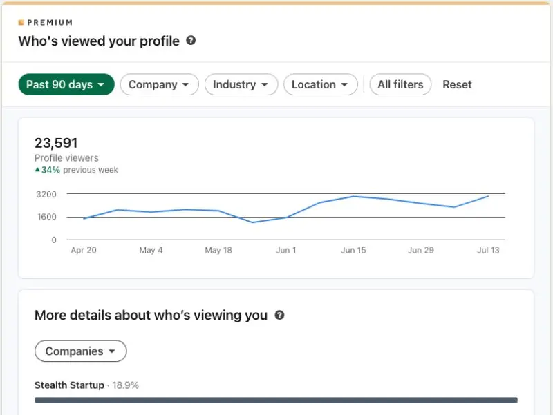
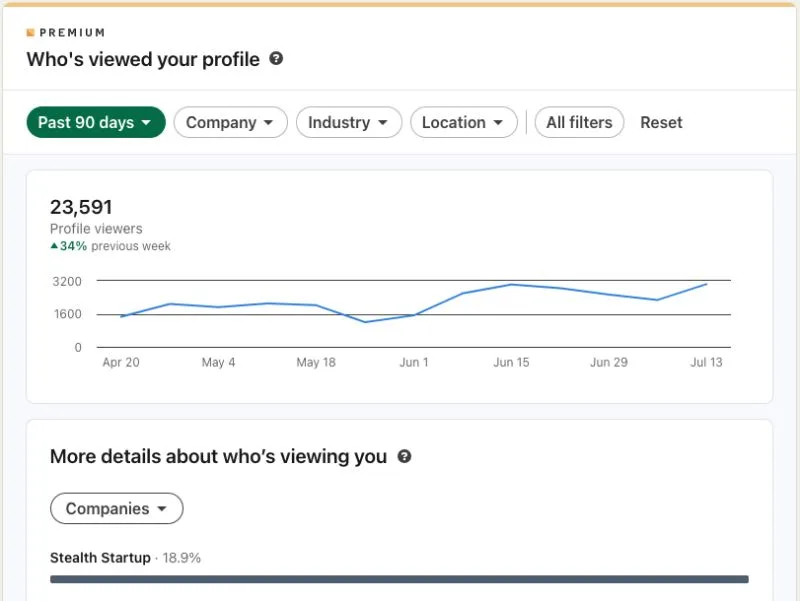
LinkedIn, let's talk: this profile viewers chart is the worst for one simple reason. The weeks in the x-axis shift every day.
So each and every time it shows up, the figures will be different. Not just the figures from the most recent week, but every number for every week. It's a magic 8-ball of data.
Super easy fix: just hold the x-axis constant. This means that the most recent week will likely be lower as it "fills up" towards the end of the week (pick Sunday or whenever, doesn't matter). That's okay! Add a little text to the chart explaining why.
Or use daily bars and a 7-day average line.
Or really anything but this 😁.
I'd also love to be able to segment profile viewers into "return viewers" and "new viewers" - could be a cool way to see if your content / brand is spreading to net new people.
The top companies / locations / industries is fun if a little bland. Shouts to all the stealth founders who've been reading our stuff however!
#insights #analytics #dataviz

DISCLOSURE: This communication is on behalf of eShares, Inc. dba Carta, Inc. ("Carta"). This communication is for informational purposes only, and contains general information only. Carta is not, by means of this communication, rendering accounting, business, financial, investment, legal, tax, or other professional advice or services. This publication is not a substitute for such professional advice or services nor should it be used as a basis for any decision or action that may affect your business or interests. Before making any decision or taking any action that may affect your business or interests, you should consult a qualified professional advisor. This communication is not intended as a recommendation, offer or solicitation for the purchase or sale of any security. Carta does not assume any liability for reliance on the information provided herein. © 2026 Carta. All rights reserved. Reproduction prohibited.