A universal truth: most radar charts should just be bar charts.
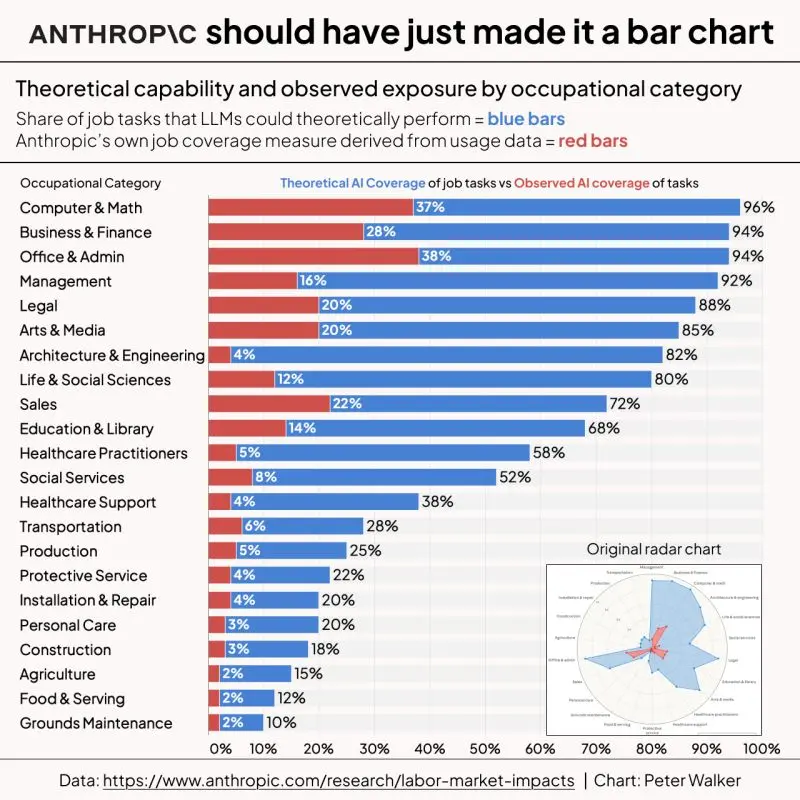
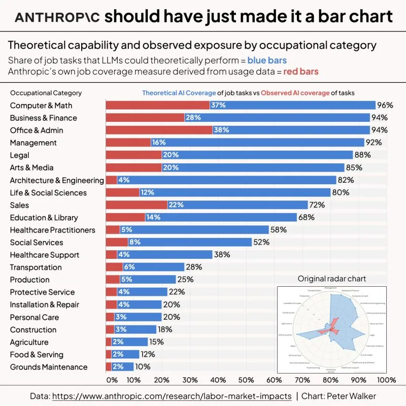
The most recent Anthropic paper on the economic impact of AI had a standout data viz - this spiderweb radar chart showing their estimation of the reach of AI into various job tasks.
Blue represents the theoretical AI coverage of a set of tasks while red is a bit of a guess (from Anthropic's own usage data) about actual coverage today.
I get it, the radar view is alluring and kinda spooky, etc. But per usual, this probably should have been a bar chart.
So I re-charted 😁
Easy to compare across the categories and the ranking of occupations is frankly just calming to my mind.
...even though the data is kinda alarming.

DISCLOSURE: This communication is on behalf of eShares, Inc. dba Carta, Inc. ("Carta"). This communication is for informational purposes only, and contains general information only. Carta is not, by means of this communication, rendering accounting, business, financial, investment, legal, tax, or other professional advice or services. This publication is not a substitute for such professional advice or services nor should it be used as a basis for any decision or action that may affect your business or interests. Before making any decision or taking any action that may affect your business or interests, you should consult a qualified professional advisor. This communication is not intended as a recommendation, offer or solicitation for the purchase or sale of any security. Carta does not assume any liability for reliance on the information provided herein. © 2026 Carta. All rights reserved. Reproduction prohibited.